Sutherland designed a number of tapestries for Dovecot from the late-1940s onwards. Dovecot was one of the weaving studios competing for the commission to weave his tapestry design for Coventry Cathedral, which eventually went to a French studio. Apparently, negotiations got so far that a wall was knocked down at Dovecot's original studio to create the room needed for a big enough loom!
Sutherland's creation of images which were confined to the picture frame and made little reference to continuing outside it made his work highly suitable for tapestry. The rich colours or red, green and yelow also translated well and gained greater depth in their depicition in wool.
The highlight of the week was locating one of the Wading Birds tapestries in the collection of the Vancouver Art Gallery - they subsequently informed me that the cartoon for it is in the Art Gallery of Ontario, Toronto. Clearly reading Agatha Christie novels has rubbed off on me - I am a modern day Miss Marple.
 |
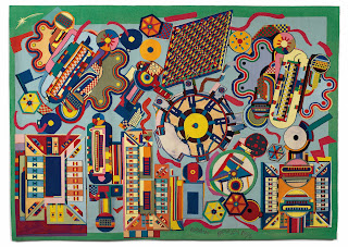
| Pearson Tapestry, 1996, designed by Eduardo Paolozzi, woven by Douglas Grierson, David Cochrane and Naomi Cleaver. Photo: Shannon Tofts. Private Collection |
This seems to bear a resemblance to his working methods in printmaking of the same period. In an article by Lucius Grisebach, the writer describes how Paolozzi started to design his screen prints using black and white photographs which were further translated into simple black outlines. It was only later in the process, in collaboration with the printer(s) that the colours were decided upon.
Next week I am off to theEdinburgh Tapestry Workshops archives on Mount Stuart, Bute. There is little in the archives on the 1950s to 1970s so I am hoping to fill some gaps by looking at the minutes for the AGMs with Elizabeth Cumming, the curator of Dovecot's 2012 centenary exhibition and my partner in crime.